Your website’s header image is often the first thing visitors see. It sets the tone, evokes emotion, and should leave a lasting impression. But with the myriad of screen sizes available today, ensuring your image looks its best on every device can be a challenge. Let’s delve deeper into the intricacies of image ratios, responsive design, and how to optimise your visual content for maximum impact.
The Science Behind Image Ratios
As mentioned, image ratios are the cornerstone of responsive design. They determine the proportional relationship between an image’s width and height. For instance, a 16:9 ratio means the image is 16 units wide for every 9 units high.
Common Image Ratios and Their Applications
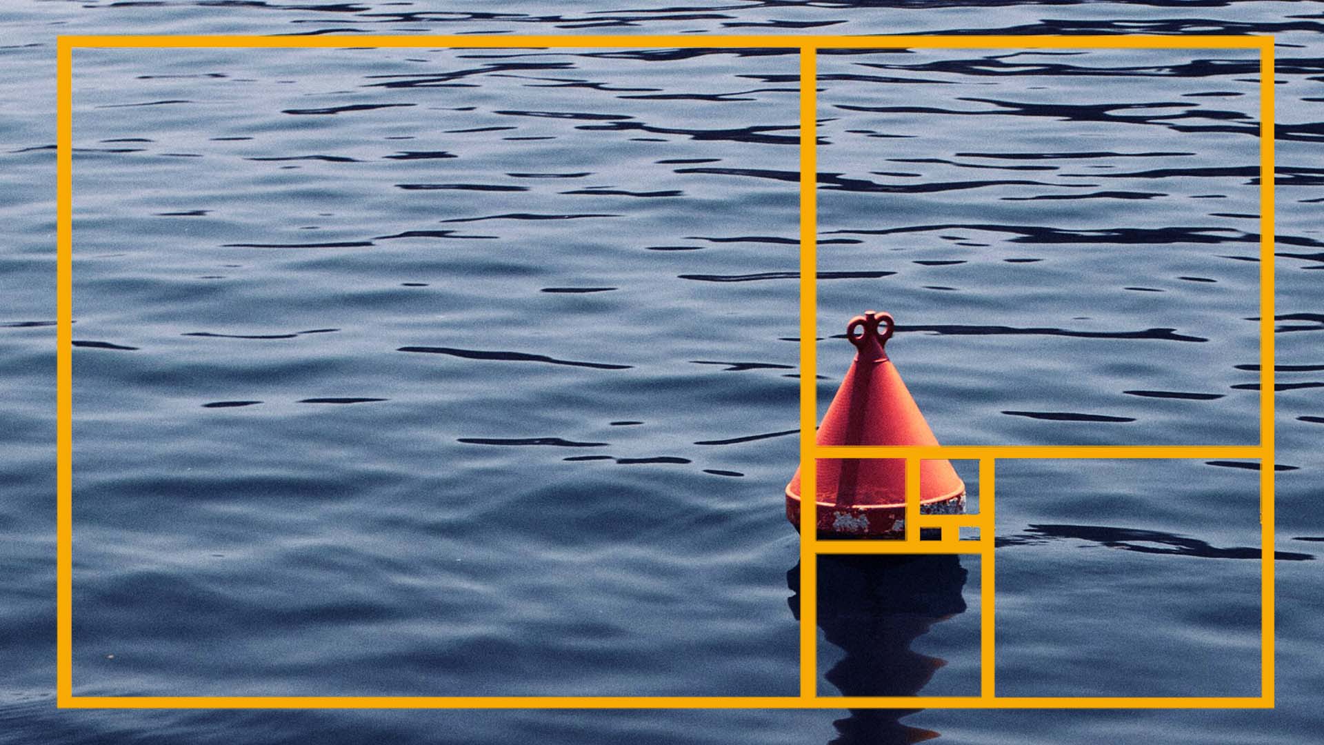
16:9
This widescreen format is ideal for desktop and laptop displays. Its popularity stems from its use in television and video formats and is very suitable for use in full screen header backgrounds. Here’s an example of how a square image would be displayed in a 16:9 ratio, with the shaded parts not being visible.

9:16
This vertical orientation is perfect for mobile devices. It ensures images fill the screen without excessive cropping. Again the image below shows how a square image would be cropped to fit a phone screen, with the shaded parts being hidden.

2:1
A versatile ratio that works well for half-screen headers on desktop and larger tablets. It provides a good balance between width and height while still allowing other content on the page to be visible to the user (unlike a full screen header). The challenge with this is a smaller height is visible, which results in the need to concentrate the image content closer to the centre, with less height to show the image. Once more, the image below shows how much of a square image will be lost when using a header that is 50% of the screen height.

The takeaway from this is that while these are common ratios, there’s no one-size-fits-all solution. The optimal ratio depends on the specific design and content of your website and the greatest consideration must be what the image will look like when it’s used in each screen size. Does the cropping affect the “story” of the image to a point where it looses context (think of heads being “cut off”) or are multiple images required to ensure a suitable fit on all devices.
Beyond the Basics: Custom Ratios
In some cases, you may need a custom image ratio. For example, if your logo or key visual elements are located in specific areas of the image, you might need a ratio that preserves these elements across different screen sizes. Some forethought and planning can help you determine the best custom ratio for your needs.
The Role of Responsive Design
Responsive design is the magic behind your website’s ability to adapt to different screen sizes. It involves using flexible grids, fluid images, and CSS media queries to create a seamless user experience.
How Responsive Design Affects Images
While responsive design is a boon for overall website usability, it can pose challenges for images, especially in header sections. As the screen size shrinks, the image may be resized, cropped, or stretched to fit the available space. This can distort the image, hide important elements, or simply diminish its visual impact.
The Importance of Focal Points
To mitigate these issues, it’s crucial to identify the focal point of your image. This is the area that you want viewers to focus on. Ideally, the focal point should be positioned near the centre of the image. This way, even if the image is cropped, the essential elements will likely remain visible.
Video Backgrounds: A Dynamic Challenge
Video backgrounds can add a dynamic and engaging element to your website. However, they present unique challenges in terms of responsiveness.
Key Considerations for Video Backgrounds
-
- Video Format: Ensure your video is optimised for different screen sizes and devices.
- Video Content: Position the main subject or action near the centre of the frame to minimize cropping issues.
- Video Player Controls: Consider how video player controls will appear on different screen sizes and how they might interact with the overall design.
- Performance: Optimize video files for fast loading times to enhance user experience.
Additional Tips for Image and Video Optimization
-
- Image Compression: Reduce image file sizes without compromising quality to improve loading times.
- Image Formats: Choose the appropriate image format (JPEG, PNG, SVG) based on the image content and desired quality.
- Alt Text: Provide descriptive alt text for images to improve accessibility and SEO.
- Lazy Loading: Implement lazy loading to defer image loading until they are about to be visible on the screen.
- Video Quality: Offer multiple video formats and resolutions to cater to different devices and network conditions.
By carefully considering image ratios, responsive design principles, and video optimisation, you can create a visually stunning website that delivers an exceptional user experience across all platforms and if you are having problem with getting images or videos to suit your website requirements, get in touch and see how we can help.